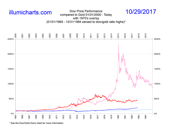
Dow Price Performance Compared to Gold Since 9/11/2001
This chart is updated every Saturday.
New! I've added a chart here that shows a comparison of the Dow and Gold today and the Dow and Gold in the 1970's. The charts are zeroed to match the dates of the peaks in the Dow/Gold Zoom.
This chart is simply a percentage comparison between the prices of the Dow Jones Industrial Average and the price of gold in US dollars. It is created by dividing the initial closing values of the Dow and gold on 9/11/2001 by 1. The values obtained are then multiplied by each price point until today to show how the prices differed percentage wise.
As you can see, as of January 2013, gold has outperformed the Dow by nearly 500%. That means that while the Dow doubled, the price of gold has multiplied 6 times in the same time period. This roller coaster of prices is driven by the business cycle which is in turn caused by monetary inflation caused by credit expansion. See the Dow/Gold Zoom for more information.
Data for the price of gold comes from the daily London Fix and is available on Kitco's website. Data for the Dow can be found at Yahoo! Finance.

